In the digital age, all kinds of information are bombarded, choices are blooming, and people’s consumption outlook has undergone tremendous changes. When people choose products, they are not only satisfied with their needs, but also with brand requirements, and businesses are turning to attract more brand followers (Brand Followers).
When brands are targeting consumer groups, they should not be ignored. Young consumers are the ones with the most amazing spending power!
In 2020, Amazon China announced data that 25 to 34-year-olds have become the main consumer, accounting for 49% of the cross-border online shopping market, and they are entering the “new middle class” consumer circle.
How to catch these “young owners” so that they have a good impression of the brand and become loyal fans?
1. Master preferences and consumption habits
Young people likes faster pace. If brand design wants to capture the young consumer group, it must accelerate the speed of branding evolution and master their preferences and consumption habits.
2. Customer follows the brand
Brand evolution must include a series of combinations of marketing, communication, image, product and brand design evolution. To put it simply, where customers often appear, they must find customers and understand their “tastes”. Only by mastering the social media platforms that young people like to “stay” in order to effectively target audiences.
Younger and Eye-catching Logo
Talking about brand and marketing evolution, there are more aspects. In this article, I will focus on sharing the influence of the evolution of brand logo. After all, the first feeling brought by “appearance” is one of the keys that young consumers care most about.
This is also the reason why international brands such as Starbucks, BMW, Apple and Google have continuously updated their trademark LOGO designs and colors in recent years.
1. Concise logo design
In the age of advertising information, if a brand wants to impress the public, it must be as simple as possible. More and more brands make the logo simpler. In order to avoid dazzling, Logo should not use too many colors, resulting in a sense of pressure. Nowadays, most of the brand logos only need two or three colors to be used to the extreme.
When an enterprise designs or upgrades the logo, it is necessary to pay attention to the fit of the brand’s tone and brand positioning. For example, catering brands avoid choosing blue or purple in their color choices, because such colors can hardly arouse the public’s appetite and desire to buy, and are far from the representative colors of the industry.
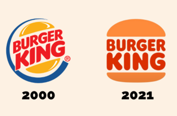
When Burger King replaced the 20-year-old logo in 2021, he said that although the past is also good-looking, it is clear that the simple and flat style is more in line with modern aesthetics and memorable.
2. Brand LOGO flattening (flat design trend)
LOGO flattening advocates conciseness and reduces complicated elements. Compared with the three-dimensional design, it makes the brand more memorable and can also be integrated into different design scenarios.

3. Changes every 3 to 5 years
Another thing to note is that the brand must also make changes at the right time, too frequently or “forever” is not appropriate. It is an ideal timeline to change the brand logo every 3 to 5 years. Of course, the scope of your own business must be the primary consideration. If the budget is sufficient, you can also consider conducting market research on industries, customer groups, regions, etc., to set the direction for design changes.
The Dilemma of getting the Evolution Process
Of course, some brands will have concerns about evolution, worrying about the impact of evolution on brand loyalty and recognition. In view of this, it is very important to not only change it beyond recognition, but also meet the needs of today’s design sense.
In the process of these changes, it is inevitable for brands to make some sacrifices. For example, when the original color of the LOGO is changed, or other changes, the market may make various criticisms, but the brand must have the confidence to cope with the “threatening period.”

Too much change or too little change will attract controversy. After Xiaomi launched its “new logo” in April this year, it was time-consuming and laborious (two million yuan was spent on the design for three years). Netizens even ridiculed Xiaomi’s “being pitted”.
However, some people think that under this turmoil, Xiaomi has only spent two million budgets but it has brought greater marketing effects. In contrast, when the Lenovo Group released the new logo many years ago, the grand press conference and the publicity fee calculated in hundreds of millions were probably not as topical as Xiaomi’s logo change this time. Regardless of whether this is Xiaomi’s propaganda operation or not, but this time Xiaomi retains the logo characteristics, everyone still remembers Xiaomi, which is a different kind of added value.
After all, the brand LOGO is the spirit of a company and a business, and represents the vitality of the entire brand product. It must be able to keep up with the changes of the times while also being able to fully tell the company’s philosophy, service and background story.

